The Ramp Group, a local digital UX agency, is co-hosting an event on Wednesday with ...
Using an Online Experience to Simplify the Offline One
Posted on June 17th, 2008
 Pathable is a new startup that helps to organize and create networking opportunities for conferences and social events. The idea is that a conference or network event organizer uses Pathable for attendees to register.
The attendees can then find people with similar interests by information that appears on the person’s badge as well as browsing on the website and receiving updates on their phone while attending the event. Another feature they are now introducing is to allow organizers to post the event agenda allowing attendees to select which talks to join.
So they came to us with an interesting issue. How do you make an online experience ease the offline one? The answer is to mimic as much as possible how the offline experience works.
As research, I took pictures while attending a conference and what the current experience is. What I noticed was that it’s a very lonely experience. People naturally wanted to find people they already know to network with. They also have a crumpled piece of paper with checkmarks on it for the talks they intended to attend, normally leaving part-way through to see if they were missing something better. When you introduce yourself to someone, they immediately stare at your badge trying to assess and size you up on who you might be and what benefit you may provide.
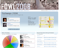
Pathable can definitely ease these pain points, but the key being that the offline experience overlapped the online one. First, we tried to make the attendee user profile page match the style, colors and layout of the actual badge that one wears at the event. We made mini color-coded versions that were used when listing attendees on other pages to make the color system be uniform through the user experience.
The other key solution was to simplify the process of selecting which talks to attend. Conferences have them organized in different taxonomy structures- by location (room number), by subject matter (Design, Development, Marketing, etc.) or by chronological order (day and time).
It also needs to provide a significant amount of information regarding each talk aside from just the topic and room number- the bio of the speaker, who is attending, the tags associated with the specific talk as well as the subject matter category.
Our solution was to have the summary of information be available at the top level with the room number called out for easier reference when glancing at where to go next with everything else available via rollover. When you click anywhere on a listing, it will mark it for you as attended in a bold red so you can quickly see which ones you flagged. You can also filter your list to eliminate subjects that don’t apply to your interests, making the list more digestible.
The design system then had an additional hurdle- generic but identifiable branding. Sounds strange, I know. The idea was that Pathable wanted the user experience to be branded but can be white labeled for any event without conflicting with the events brand. The solution was to have the style be light on design cues (buttons, boxes, color treatments) but have a stylization that could be recognizable and ownable as Pathable’s.


