Identity
Sealaska
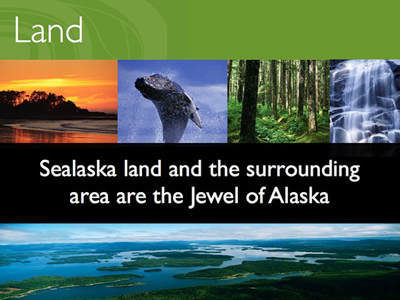
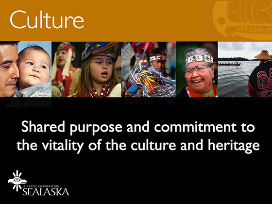
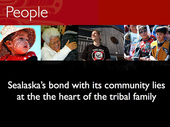
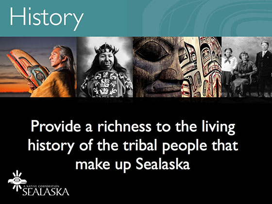
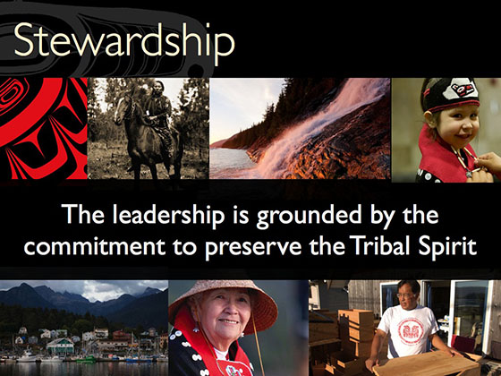
Sealaska is the largest Native American land corporation in Alaska, supporting the three local tribal groups of the area. Sealaska’s challenges, in many ways, are not unique- preserving a cultural significance to your heritage while looking to grow and be relevant. What they needed was a brand strategy to communicate their vision.
Inner Agency
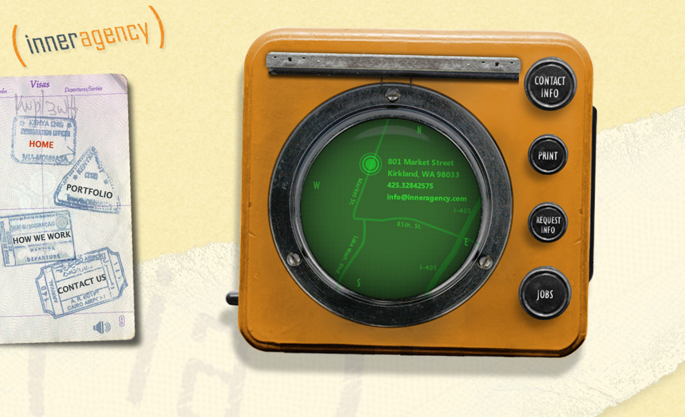
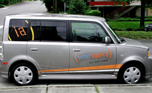
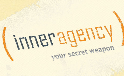
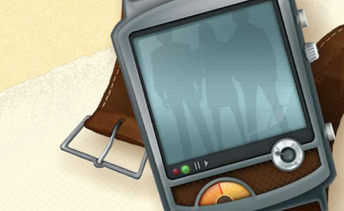
THE SECRET SOURCE
I led this in-house design team to extend their capabilities and reach with a brand strategy devised to emote creativity. The “secret agent” motif reflected the light-hearted, casual ethos of the agency. This brand stance allowed them to extend their reach past the in-house model and into the competitive agency world with a fresh look and feel.
Trulia
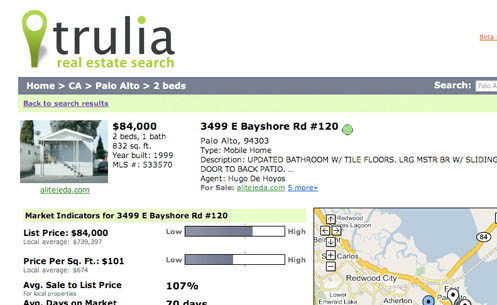
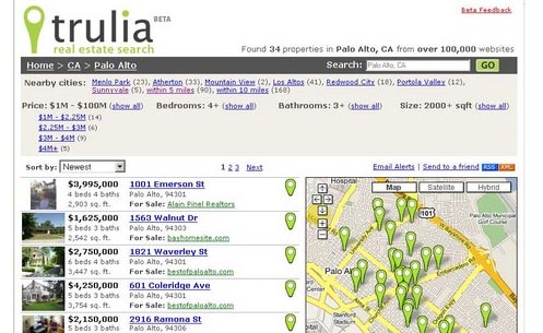

SEO HITS THE MARK
Trulia is a real estate aggregate site that combines Google Maps with search results. The User Interface needed to be built so search engines like Yahoo! And Google could spider through the entire inventory of properties. This was so effective that Trulia became the #1 real estate Google Search result immediately after launch.
The Trulia mark was designed with extensibility in mind. It is used in the map interface, as a highlighted feature of the UI and as an integral part of the identity system.
Virgin Travel Group
BRAND SIGNIFICANCE
AUDIENCE LOYALTY
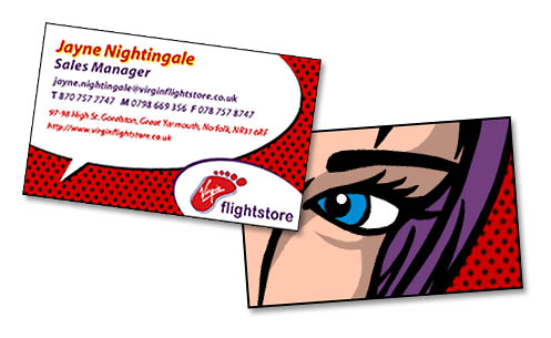
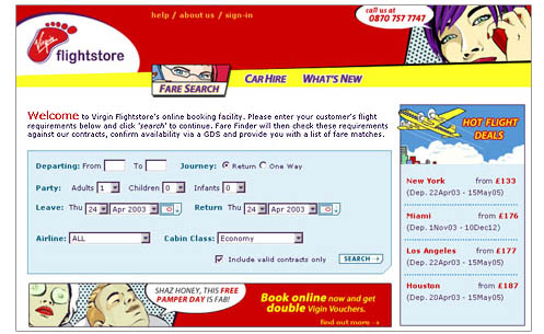
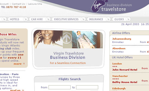
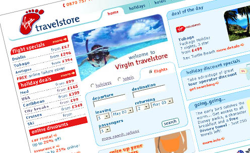
Virgin Travelstore’s core audience is loyal to the Virgin brand and expects Virgin’s core values to be represented. All aspects of Virgin Travelstore were overhauled to emphasize value, ease-of-use, and edginess. Virgin Travelstore tripled its monthly sales by increasing the opportunities for cross-selling and reducing the steps required to purchase.
Many advanced features were built into the various interfaces of Virgin Travelstore’s sections. All functionality, production, design, and production decisions were based on business needs. The Flights section functionality and layout were designed to streamline the searching and selecting process. The Holidays section was designed to provide resort information to support the user’s sale decision.
Virgin Travelstore’s sales increased three-fold and went from 10th in the UK to 5th top online travel site.
Toyota
COROLLA SOCIAL DRIVER CAMPAIGN
FUN AND PLAYFUL
In support of Toyota Corolla’s Social Driver Campaign, PPMG created a kicky party planner and sweepstakes mini-website that furthered the fun nature of the Corolla brand. We provided information architecture, design, illustration, and development for the initial launch and 3 subsequent site refreshes. PPMG successfully tied Toyota Corolla’s print ad campaign with the online experience and gave their representing agency an excellent resell opportunity with the Flash party-planner application. The robust experience included many online-community functionalities such as: blogging, sharing to mobile phone, automated sweepstakes entries, photo-sharing, and user-generated content.
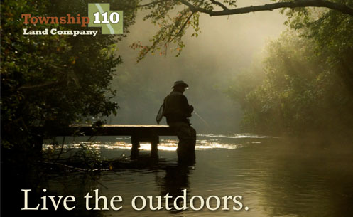
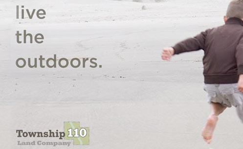
Township 110
TOWNSHIP 110 BRANDING
TREASURING NATURE
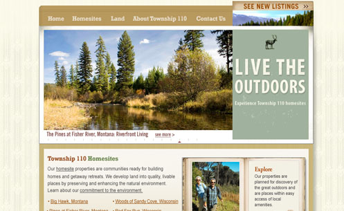
Township110 offers exurban retirement/second home living in rural areas throughout the United States. Perfect Pixels worked closely with the company’s executive team to create a logo and tagline that reflected Township110’s integrity and environmental policies.
The tagline speaks to the outdoor enthusiast on a visceral level. The intention as to create a tagline that’s tone could apply to various demographics.
This site needed to speak to the target audience and showcase multiple land developments while furthering the brand. Perfect Pixels chose to incorporate Flash animation elements to immediately introduce the user to the beauty of the homesites with an image rotator and a flipbook. This site gives the user an overview of Township110’s land offerings and gives them the option to research further by going to the specific development itself, or to a featured homesite.
Snap Village
BRAND SIGNIFICANCE GET FRESH
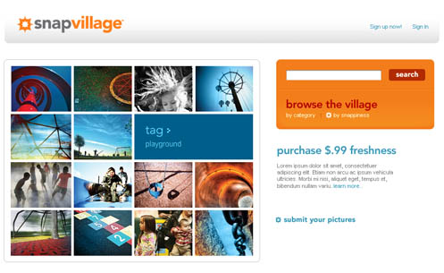
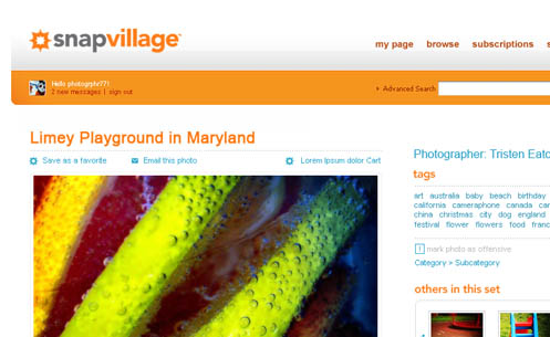
Corbis entered into the Web 2.0 space with its SnapVillage brand. Working in conjunction with another agency, PPMG created the distinctive mark that speaks directly to the core audience, photography enthusiasts. The logotype and colors were selected to provide the punch that Corbis was looking for in the brand. We used warm colors and high contrast along with a sophisticated use of white space to fulfill the brand ethos – freshness and pop.
We also consulted and provided strategic direction for interface design, user flow and information architecture.
Microsoft
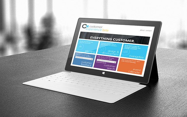
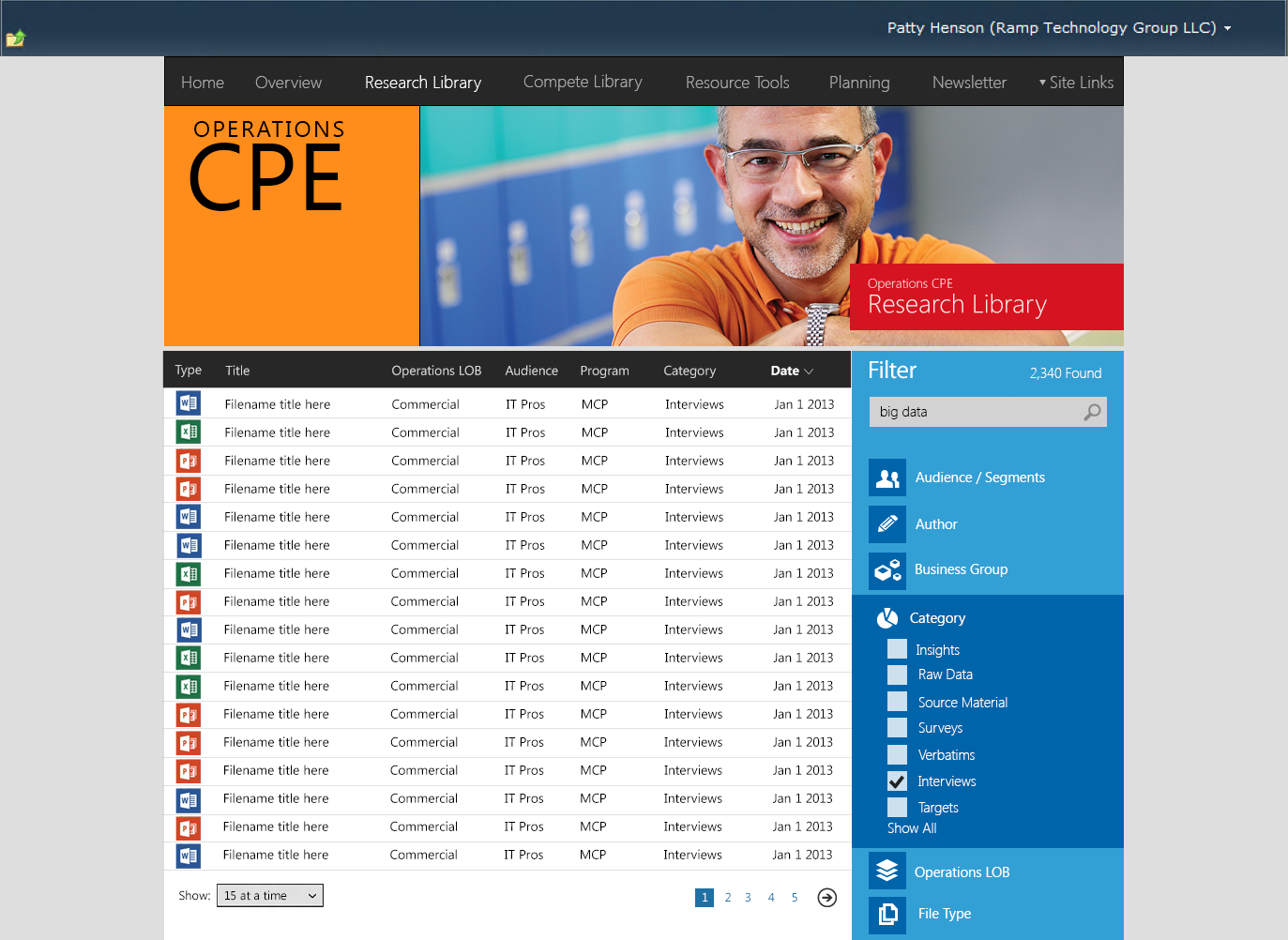
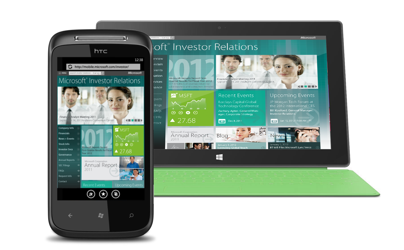
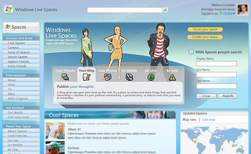
Perfect Pixels has provided design, branding and information architecture services for several of Microsoft’s brands including Windows Vista, Technet, MSN Spaces, Windows Mobile, Customer Experience Group. MS Learning and Azure.
PPMG provided innovative and out-of-box thinking for internal teams to help their various initiatives. Our approach is to work collaboratively and in-house as often as possible to make sure that we are as close as possible to providing on-target deliveries. Projects regularly required an iterative process of wireframe reviews to allow for multiple Agile sprints.
Hewlett Packard
BRAND SIGNIFICANCE HUMAN POTENTIAL
What does the HP brand mean and what role does it play in driving business? As the HP organization evolves into a decentralized model, it is crucial that the HP brand is understood internally. We were asked to identify how the brand might be redefined with greater humanist and aspirational significance.
HP customers have a vision of a better life for themselves and others. They want to experience the best things in life but not in a selfish, materialist, or egotistical way. They may dream but they are doers. The Human Potential campaign conveyed that internally and externally for a holistic brand extension that furthered HP’s business goals.
Flutter
BRAND SIGNIFICANCE BUILT FOR SPEED
Flutter.com’s move to support a Chinese version required working with a series of focus groups and translators to effectively communicate the concept of person-to-person betting to a foreign audience.
The new design dramatically increased market share from 8% to over 30% in less than three months. The original version was a tedious interface, requiring the user to step through six separate pages to complete a bet. The new interface limited the steps to three on a single screen. Another key change was to provide a separate view for novice and experienced users.