Interactive and Web
Washington State Employment Security Department
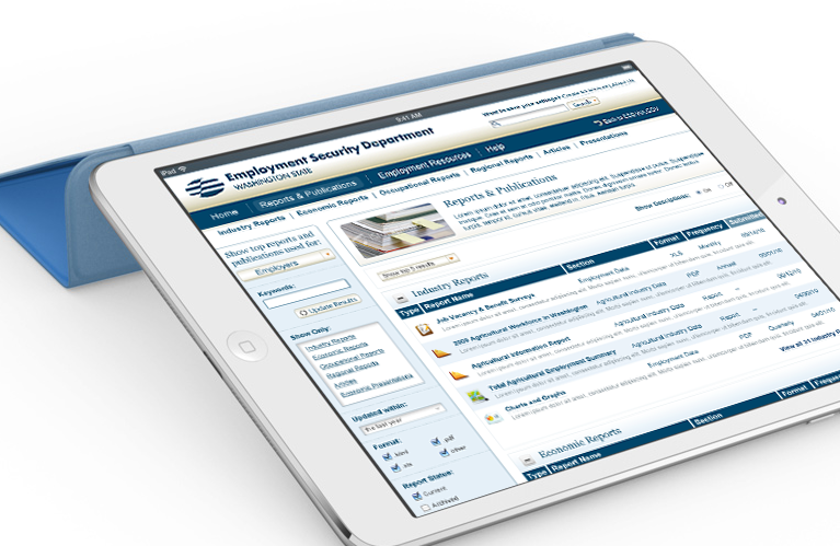
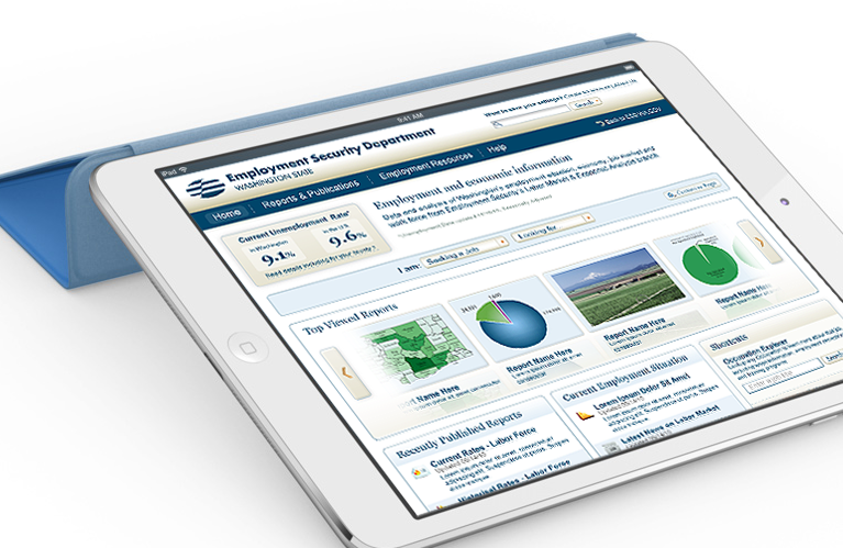
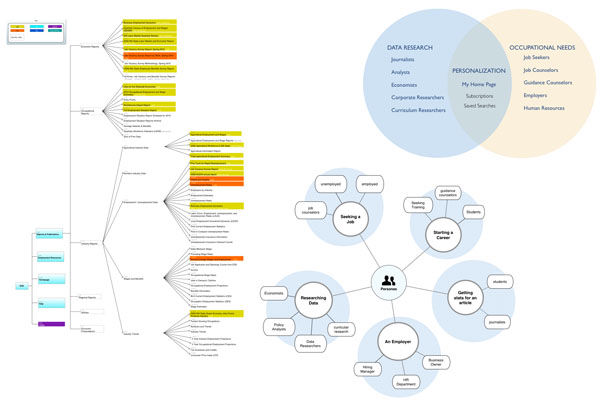
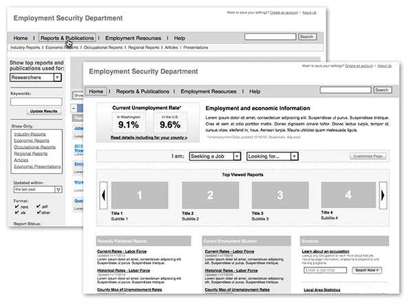
We were tasked with a complete re-architecture and redesign of the Employment Security Department‘s employment and economic information website which is set to go live in a few months. The site contains thousands of publications, reports and presentations which required a complete overhaul. The case study below describes how we accomplished this task by focusing on a persona-based, task oriented navigation structure. Usability testing showed a two-fold improvement on success rates and time to complete tasks. The ESD redesign also had won Best Government Site by eRepublic in 2012.
CareOregon
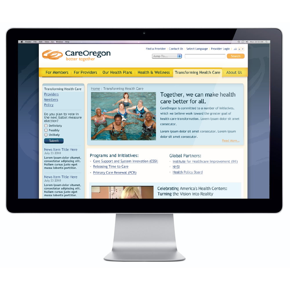
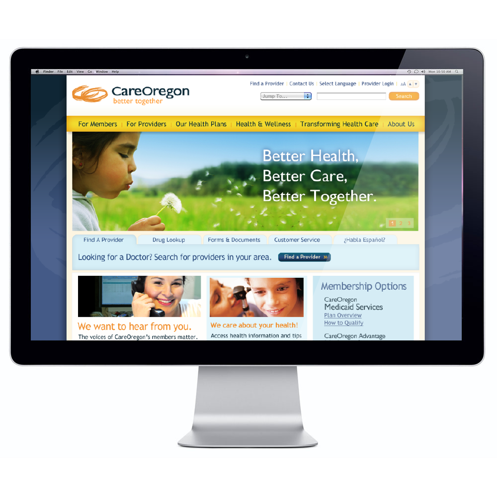
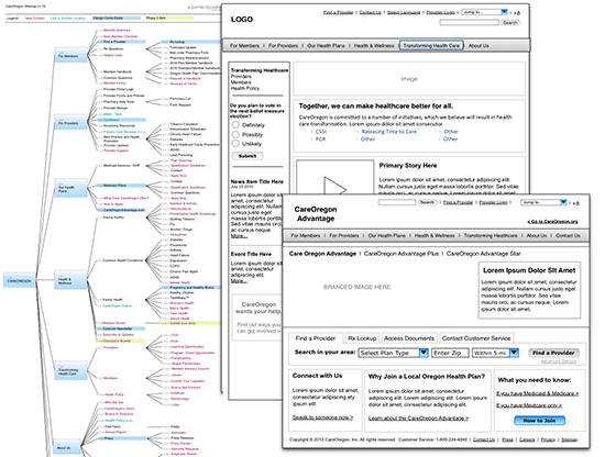
BRANDING + WEB DESIGN
CareOregon is the largest Medicare and Medicaid provider in the state of Oregon. The redesign effort was to support a re-invisioning of the brand and the website. The process included user surveys, usability tests, creating user personas, brand exploration, editorial, photography selection, content mapping, wireframing, and design. You can view the video below to hear more about the various deliverables.
The design was targeting to improve the level of user engagement and efficiency in users reaching their intended content. The following stats were pulled for CareOregon’s new site comparing the month since the launch and the previous year’s numbers for the same time period (2/7/10 to 3/5/10 and 2/7/11 to 3/5/11):
- +34.88% improvement in new visits
- -34.44% reduction in bounce rate
- +34.18% improvement in time spent on the site
- +10.46% improvement on the number of pages viewed per user
- +38.36% improvement on visitors sourced by search engines
- +35.77% on new visitors
- .02%of users relied on search (65th most visited page was search results). Previous: 10.1% , the 9th most visited page)
Check out this SlideShare Presentation. You can hit the Play button to hear the voice over:
Inner Agency
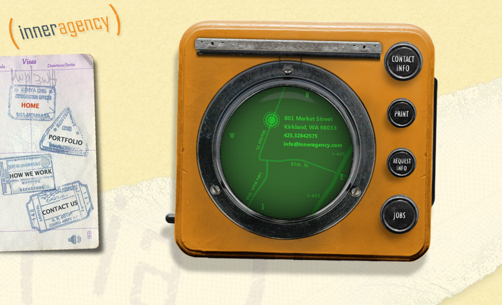
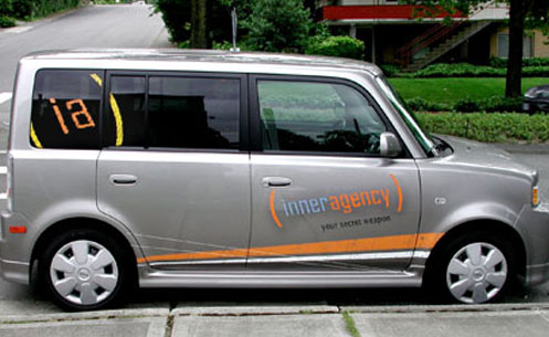

THE SECRET SOURCE
I led this in-house design team to extend their capabilities and reach with a brand strategy devised to emote creativity. The “secret agent” motif reflected the light-hearted, casual ethos of the agency. This brand stance allowed them to extend their reach past the in-house model and into the competitive agency world with a fresh look and feel.
Wild Tangent
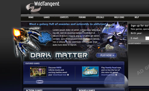
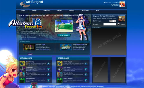
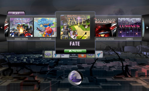
DYNAMIC EXCITEMENT
Wild Tangent, a casual game company looked to PPMG to create a dynamic, exciting, templatized homepage that could present different views based on the users profile. And the featured games that WildTangent wanted to promote.
We created a large featured game spot that extends beyond the frame of the page. We used highly saturated color and movements to represent the excitement of online gaming.
Trulia
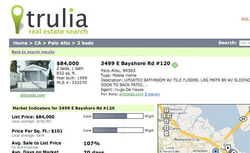
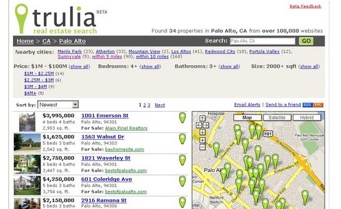

SEO HITS THE MARK
Trulia is a real estate aggregate site that combines Google Maps with search results. The User Interface needed to be built so search engines like Yahoo! And Google could spider through the entire inventory of properties. This was so effective that Trulia became the #1 real estate Google Search result immediately after launch.
The Trulia mark was designed with extensibility in mind. It is used in the map interface, as a highlighted feature of the UI and as an integral part of the identity system.
Virgin Travel Group
BRAND SIGNIFICANCE
AUDIENCE LOYALTY
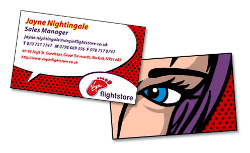
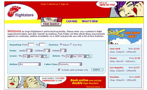
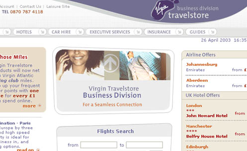
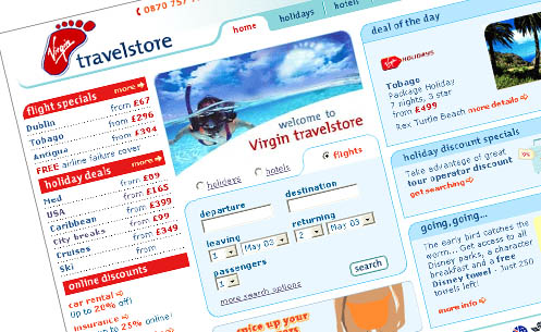
Virgin Travelstore’s core audience is loyal to the Virgin brand and expects Virgin’s core values to be represented. All aspects of Virgin Travelstore were overhauled to emphasize value, ease-of-use, and edginess. Virgin Travelstore tripled its monthly sales by increasing the opportunities for cross-selling and reducing the steps required to purchase.
Many advanced features were built into the various interfaces of Virgin Travelstore’s sections. All functionality, production, design, and production decisions were based on business needs. The Flights section functionality and layout were designed to streamline the searching and selecting process. The Holidays section was designed to provide resort information to support the user’s sale decision.
Virgin Travelstore’s sales increased three-fold and went from 10th in the UK to 5th top online travel site.
Toyota
COROLLA SOCIAL DRIVER CAMPAIGN
FUN AND PLAYFUL
In support of Toyota Corolla’s Social Driver Campaign, PPMG created a kicky party planner and sweepstakes mini-website that furthered the fun nature of the Corolla brand. We provided information architecture, design, illustration, and development for the initial launch and 3 subsequent site refreshes. PPMG successfully tied Toyota Corolla’s print ad campaign with the online experience and gave their representing agency an excellent resell opportunity with the Flash party-planner application. The robust experience included many online-community functionalities such as: blogging, sharing to mobile phone, automated sweepstakes entries, photo-sharing, and user-generated content.
Township 110
TOWNSHIP 110 BRANDING
TREASURING NATURE
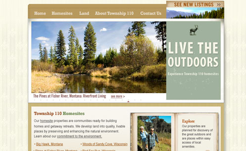
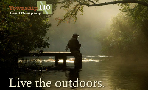
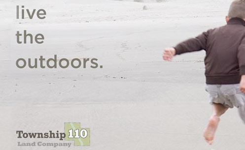
Township110 offers exurban retirement/second home living in rural areas throughout the United States. Perfect Pixels worked closely with the company’s executive team to create a logo and tagline that reflected Township110’s integrity and environmental policies.
The tagline speaks to the outdoor enthusiast on a visceral level. The intention as to create a tagline that’s tone could apply to various demographics.
This site needed to speak to the target audience and showcase multiple land developments while furthering the brand. Perfect Pixels chose to incorporate Flash animation elements to immediately introduce the user to the beauty of the homesites with an image rotator and a flipbook. This site gives the user an overview of Township110’s land offerings and gives them the option to research further by going to the specific development itself, or to a featured homesite.
Snap Village
BRAND SIGNIFICANCE GET FRESH
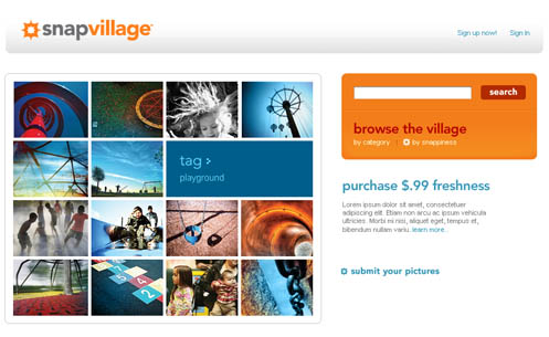
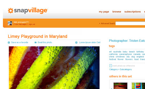
Corbis entered into the Web 2.0 space with its SnapVillage brand. Working in conjunction with another agency, PPMG created the distinctive mark that speaks directly to the core audience, photography enthusiasts. The logotype and colors were selected to provide the punch that Corbis was looking for in the brand. We used warm colors and high contrast along with a sophisticated use of white space to fulfill the brand ethos – freshness and pop.
We also consulted and provided strategic direction for interface design, user flow and information architecture.
On Request
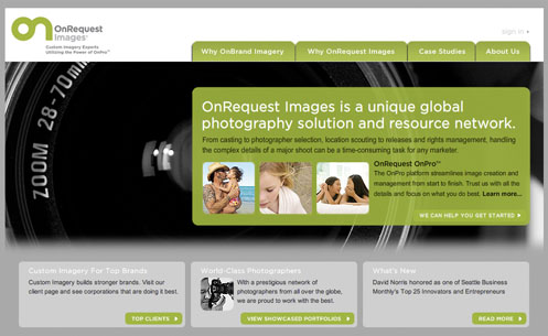
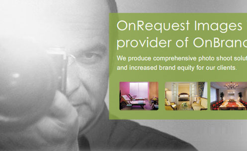
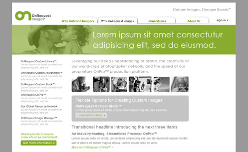
DESIGN SIMPLICITY
On Request is a photographer resourcing service that needed to extend their brand with a new website design. Working in conjunction with another agency, PPMG provided a design that heavily branded On Request while also making the carious photographers’ work the hero. PPMG designed a Flash-based extensible page template. This design was flexible enough to accommodate the various types of content that would exist on the OnRequest website.